
A platform built to connect Africa’s startups and diaspora
Bantaba is a platform that connects startups in Africa with Africans who have moved out of the continent and enables them to invest, mentor or consult the startups.
The company was born in 2020 from the idea of leveraging resources in the African diaspora to empower Africa’s tech ecosystem. They compare themselves with Tinder but with a different type of love – a love for Africa.
The Problem
In early 2022, Bantaba released a new version of their platform with a reworked UI and with new functions. However, according to surveys and interviews, users still weren’t very satisfied and asked for an improved UX.
So, how do we improve the UX of Bantaba’s platform?
My steps to tackle the challenge
- Impact Map
- Persona creation
- WCAG & UX Review
- User Tests
- User Journey Map
- Brainstorms
- Wireframes
- Prototype
Understanding stakeholders’ real needs
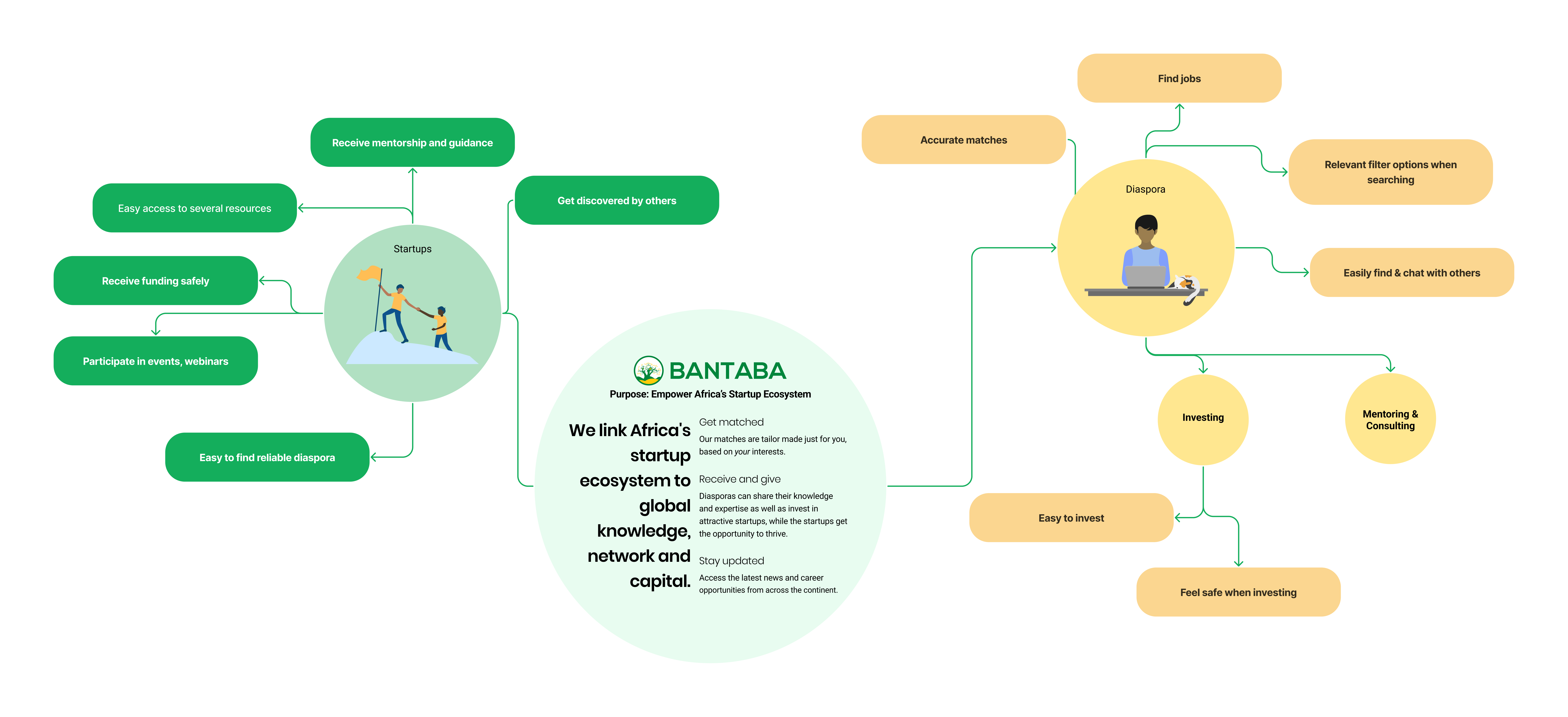
I made a basic Impact Map where I mapped out the primary stakeholders (African diaspora and tech startups in Africa) and their basic needs. I continued to update the map during the course of the projects, adding in more needs, and secondary stakeholders.
I went for an Impact Map as it'd be a constant reminder for me what the stakeholders' needs are.
Seeing the platform through founders’ eyes
I created three personas that would help me envision the startups’ needs.
At first I wasn’t sure if I wanted to create startups or users as personas, and I ended up doing both for the most realistic and effective persona; for each persona, I also made a startup. This way, I could put myself in the individual’s shoes, as well as the rest of the startup.
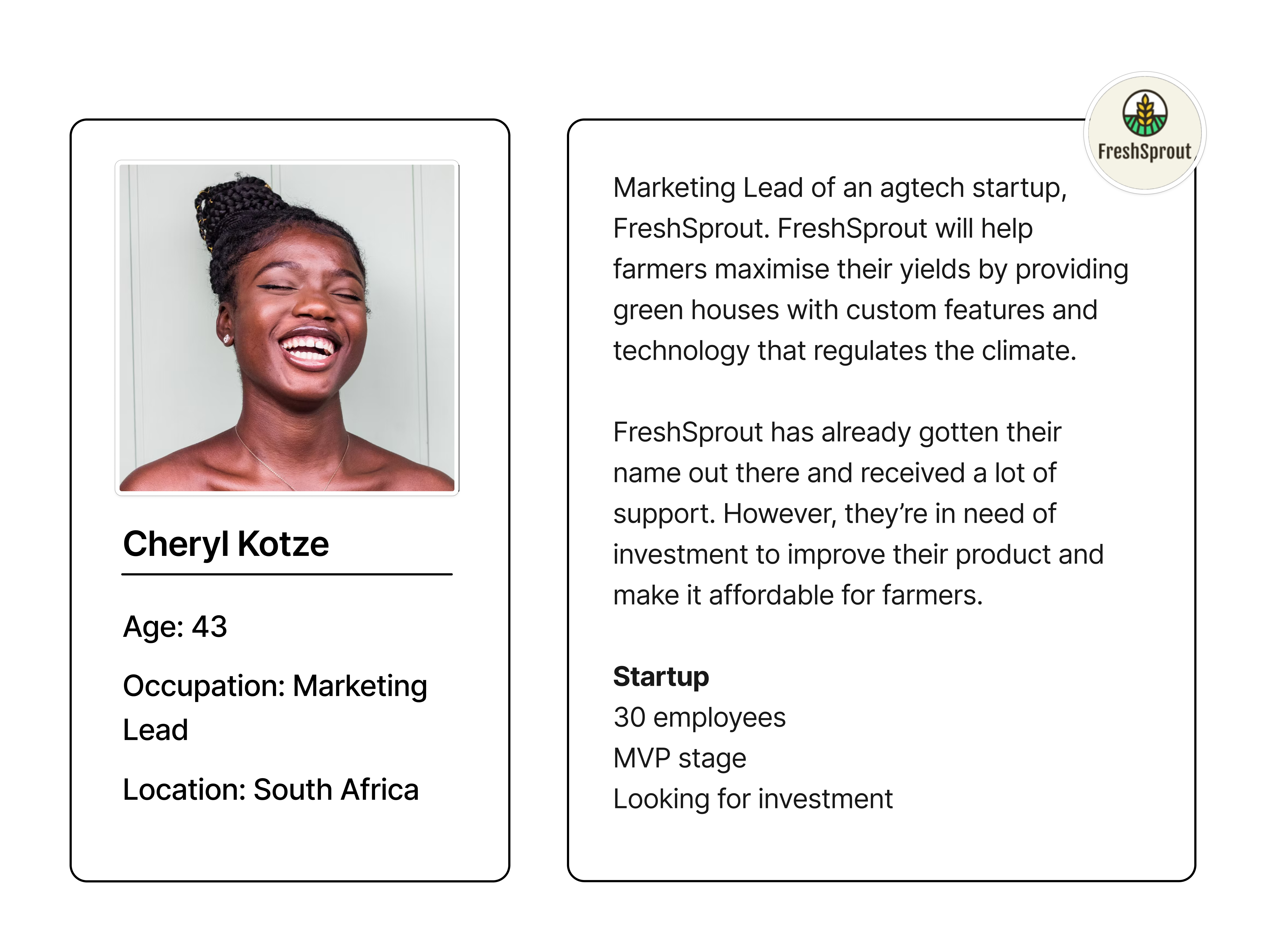
One of the personas I made. I based each individual and startup on Bantaba's users to make sure they'd be relevant.
The reason I made personas is simply that I am not in our target group, and I thought personas could help me see things through a founder's eyes. For instance, if I'm unsure about a feature, I could ask myself, "What's the value for Cheryl if we do [...]?". It ended up making things easier for me in the project as it helped make things less abstract.
Turning pain points into priorities
I did user tests and interviewed 5 people of varying ages, from 20 to 75+, to find out users pain points. I always ensure to do user tests with seniors, as they tend to have a harder time figuring things out and therefore easily find issues.
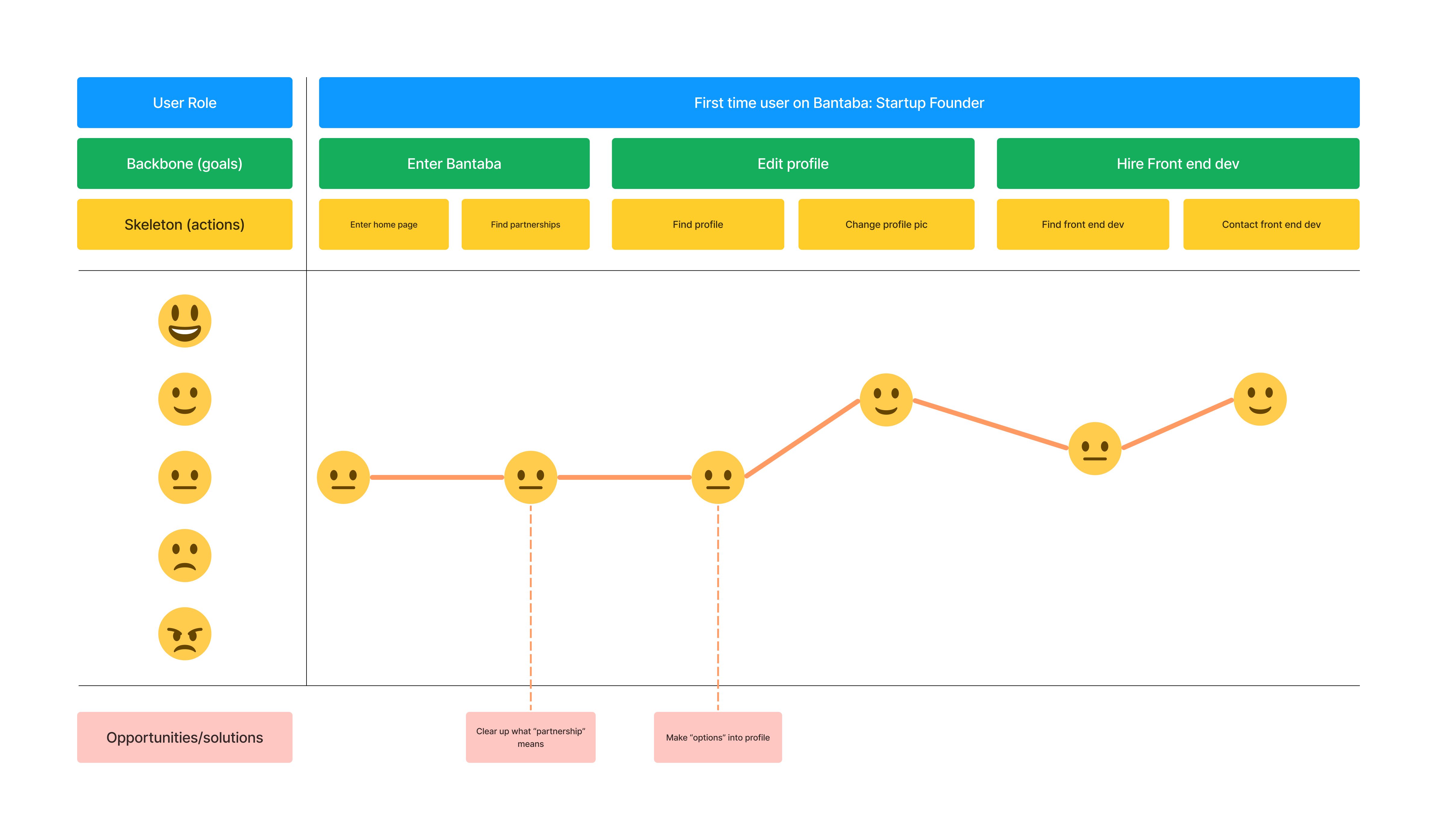
Based on these tests, I created a user journey map to get a feel of how the average user experiences their first time on the platform. This let me know what works and what doesn't, and helped me prioritise things to work on.
Design changes that made the difference
Matches need to feel personal
The original carousel only showed a name and photo, giving users no real reason to click. The redesign made matches feel useful and personal:
- Replaced carousel with two static cards for clarity
- Added key info: education, services offered, years of experience
- Introduced save and dismiss actions

Supporting startups through resources
I expanded the sidebar to provide real value beyond networking:
- Resource Center with guides, templates, and articles
- News box with events and opportunities
These additions gave founders quick access to knowledge and updates they needed in their startup journey.

Making the Community page faster to use
The Community page originally sorted options alphabetically and placed filters in a confusing order. I redesigned it to make finding relevant people easier:
- Reordered filters: Engagement type → Expertise → Country
- Sorted categories by quantity, not alphabet
- Added search inside filters
- Displayed years of experience under profiles
These changes helped users discover relevant mentors, consultants, and investors much faster.

Cleaning it up
The original feed didn't feel too modern, so I lightened it up, gave boxes more shadow underneath, and reduced the amount of colours in the sidebar.

From Lo-Fi to Hi-Fi
Drag the slider to compare my early wireframe with the final design of the home page.
Reflections and next steps
The next step would be further testing of the prototype, to make sure these designs give a great user experience.
This was a big project I took on alone, with a deadline of 2 months. Yet, I got quite far. I've gained more confidence in my research skills, and impostor syndrome is starting to affect me less as well.
I do believe there are a lot more things that can be done to further improve the UX, and that this is mostly touching the tip of the iceberg. Getting a good UX is different from improving the UX, though, and that’s something I need to keep in mind. I can’t solve all problems in one single project.

