Tiny Brains, Big Impact
BrainZell is a biotech startup which grows mini brains from human stem cells for research purposes. These organoids are then infected with diseases, allowing BrainZell to test and identify potential new treatments. This process replaces animal testing and promotes a more sustainable method for medicine discovery.
Setting the Foundation
As a startup in its early days, BrainZell had a very basic website. It lacked the depth, visuals, and structure needed to resonate with their target audience—investors.
My role as the sole designer entailed creating a website that would build credibility, inspire trust, and highlight the BrainZell's innovative mission. In just three months, I created a 5-page website that showcased BrainZell's amazing achievements and potential.
The Process
- Discovery
- Strategy & Planning
- Wireframes
- Content Creation
- Implementation
Identifying Opportunities
To grasp the scope of this project, I focused this phase on understanding BrainZell's expectations of me and the goals of the upcoming website.
Approach:
- Conducted a competitor analysis of 30+ biotech websites to identify industry best practices in branding and structure.
-
Facilitated workshops to define the website’s
goals:
- Building awareness.
- Inspiring trust.
- Creating clear calls-to-action for contact and collaboration.
- Identified the target audience: investors in life sciences, pharma, and biotech.
Taking a Look at Competitors.. 👀
To build a website that inspires trust and aligns with industry standards, I analyzed over 30 biotech websites to uncover best practices and common pitfalls to guide our redesign.
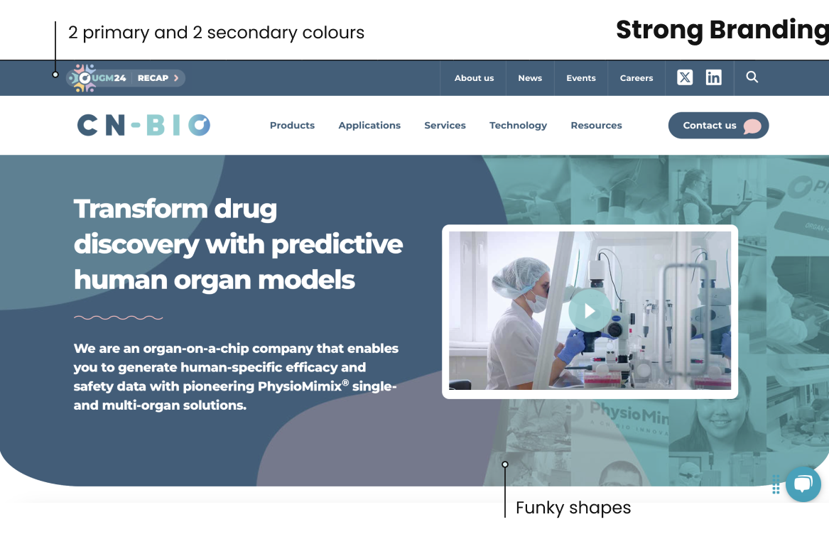
Things I learned from the competitors:
Strengths to incorporate
-
Strong Branding and Consistent Design
- Cn-bio has a defined branding throughout the website which creates a pleasant experience.
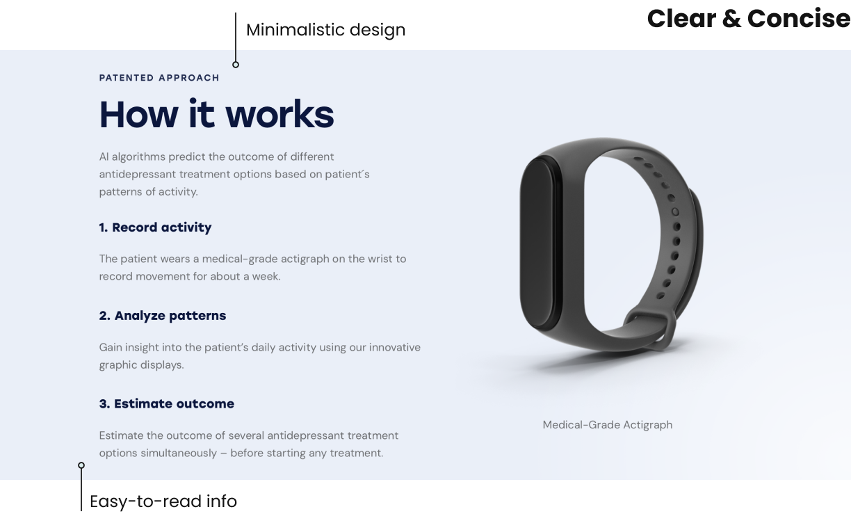
-
Minimalistic Design
- Brings the attention to where it matters!
- Appealing Images
Weaknesses to avoid
-
Hover Elements
- They cause accessibility issues and don’t translate well to mobile devices!
-
Overwhelming Design
- Personally a big no-no for me!
Building the Roadmap
With a clear understanding of the competitive landscape, it was time to define the structure and style of BrainZell’s website!
Workshop
I facilitated a workshop in order to figure out which pages to have, what sections to have on each page, and the visual style direction. We were three people in total.
Visualising the User Journey
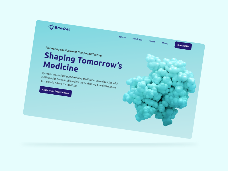
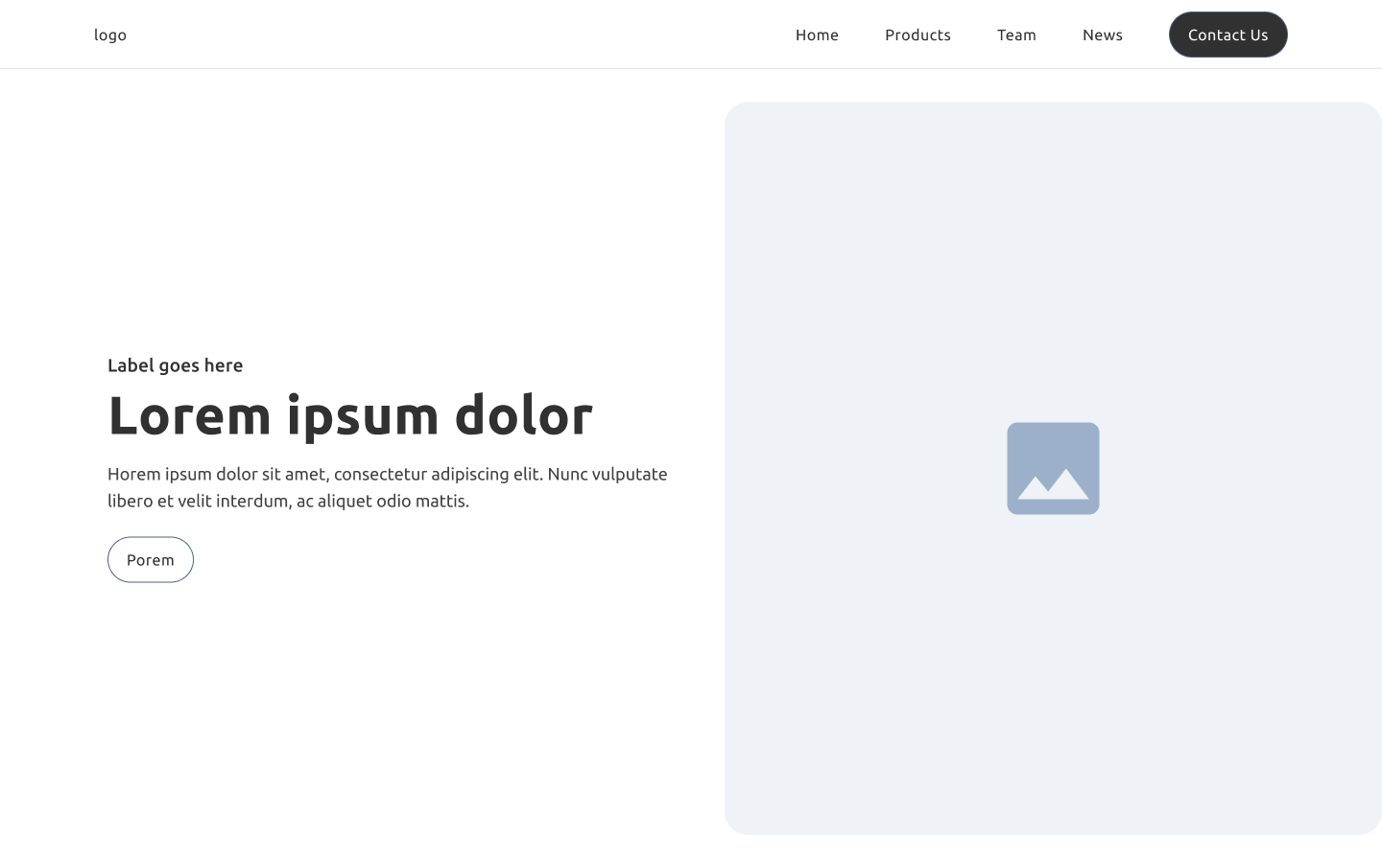
I initiated this phase with the creation of low-fidelity wireframes, which provided a basic structure and layout for the website. Upon gathering and incorporating feedback, I then progressed to crafting high-fidelity prototypes. I played around with colours and ended up with a blue gradient style, based on BrainZell's colours.
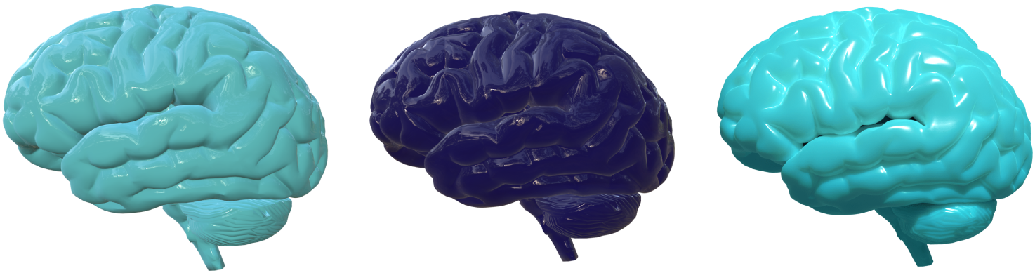
Science is Art
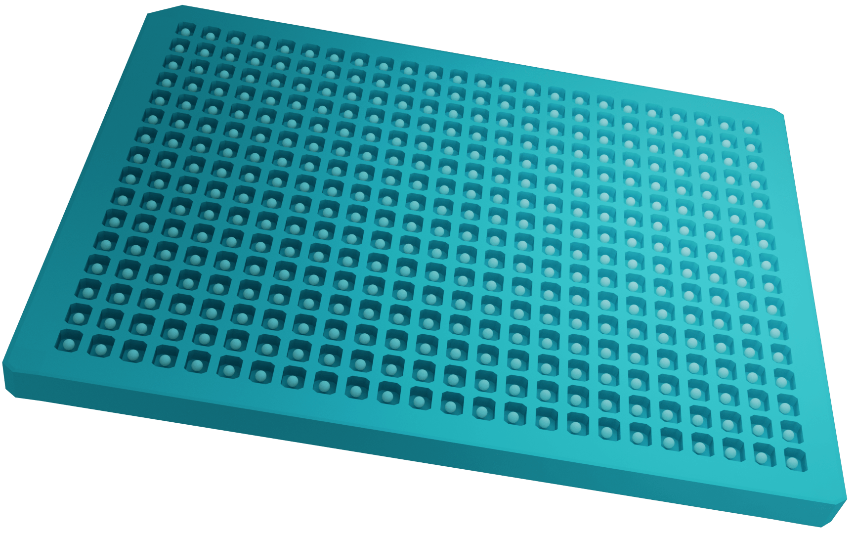
In the workshop I facilitated earlier, we decided on going with a 3D style to stand out. I used Blender create 3D images, one brain and a plate with mini brains. The so-called "well plate" is where BrainZell grows the actual organoids.
This was my first time making something 3D. The brains I used a free asset for, but I made a lot of changes to it, and the plate I made from scratch.
 Iterations of the 3D brain. Brainzzz.
 Those spheres are brain organoids! Pretty cool. Except
that these are made by me in 3D, but they're based on
the real thing.
Those spheres are brain organoids! Pretty cool. Except
that these are made by me in 3D, but they're based on
the real thing.
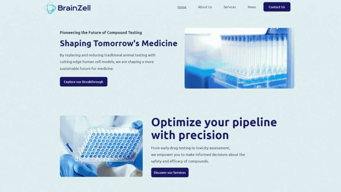
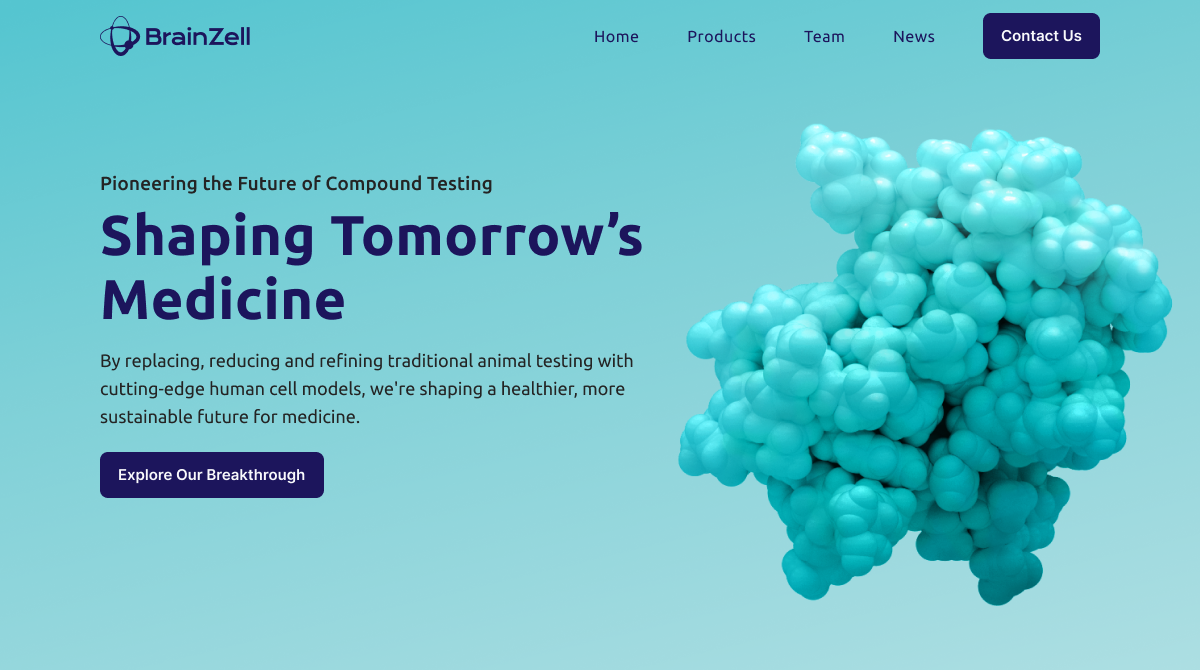
A Change of Plans...
As I was wrapping up things, I was told in a meeting that the wireframes needed to be reworked. Although BrainZell appreciated my work, they wanted to change the direction of the website and include images of real people and devices rather than 3D-modelled ones.
And so, we worked together to find pictures we thought would fit, and also ended up finding a video for the header. A video rather than an image would keep the website "alive". The root of medicine is to keep people alive and healthy - A static website didn't convey this.
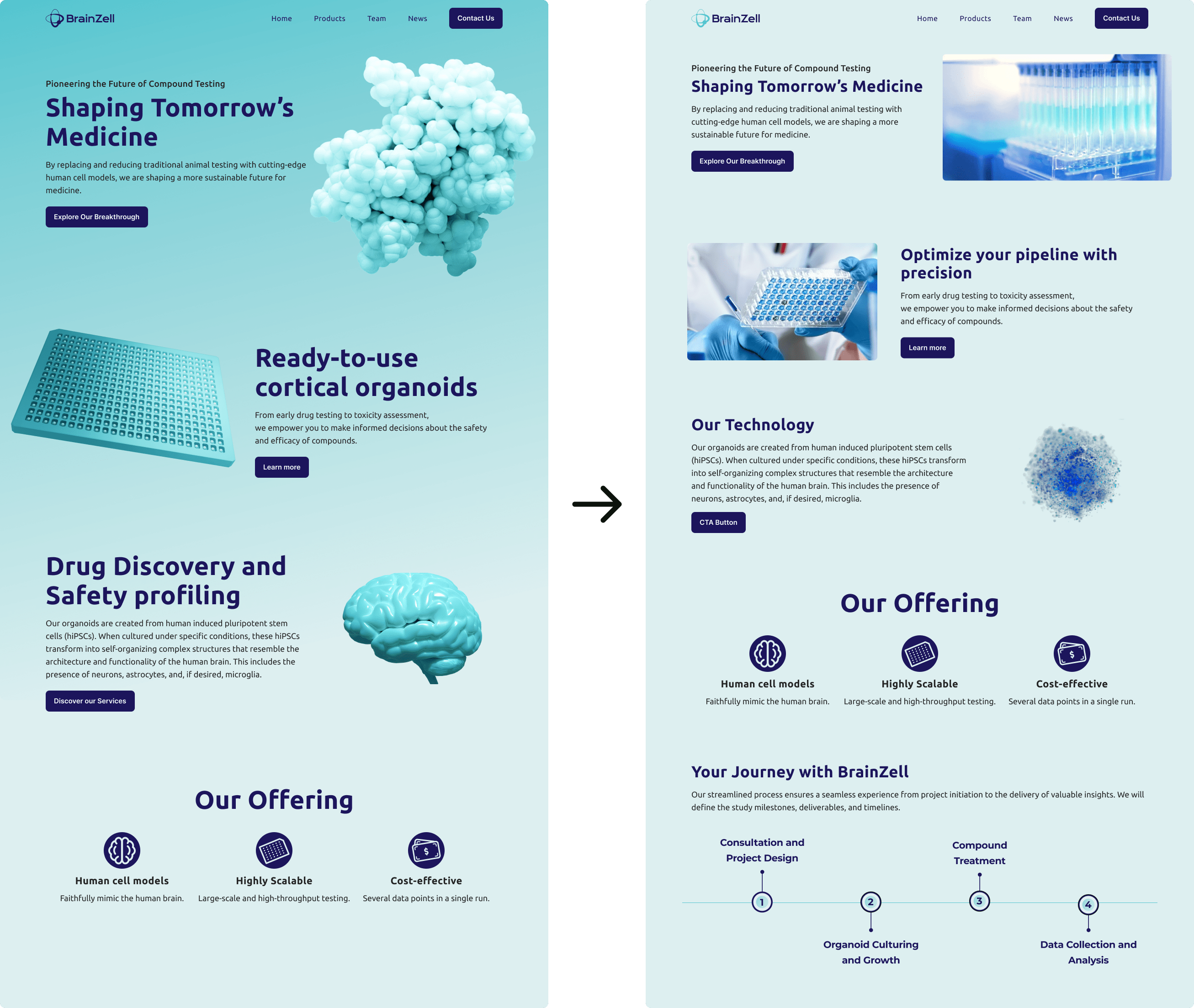 I re-strategised and made changes to the design
according to feedback. The new version has a simpler
background and colour palette, the images are no longer
abstract, and details are refined.
I re-strategised and made changes to the design
according to feedback. The new version has a simpler
background and colour palette, the images are no longer
abstract, and details are refined.
Time for Low-Code
BrainZell used a no-code platform called one.com to host their website. It was my first time using this particular platform to develop a website, but most platforms share similarities so I was able to adapt.
Implementation
- Built the website on a no-code platform (One.com) and customized it with code
- Integrated a WordPress blog for news updates
- Took around 2 weeks to develop!
Results
- Simplified navigation and intuitive layouts, which improved user engagement.
- Clear calls-to-action and cohesive visuals
- Stronger Brand Identity
Reflections
Throughout the project, a couple of challenges emerged that required creative problem-solving. One obstacle was the realization that the low-code platform (One.com) lacked a blog function which was important for the team. I ended up integrating WordPress, which I then had to spend time coding to get it looking as much as the rest of the website as possible.
Another challenge was, as mentioned, reworking the style of the website when I had almost finished the protoype. But we pulled through!
Lessons Learned:
- Flexibility is Key: Embracing changes can lead to stronger outcomes.
- Collaboration Drives Success: Regular feedback loops ensured alignment with BrainZell’s vision.
On a Closing Note
Once I was done coding, the project was complete - I had successfully translated the BrainZell concept into a fully functional website from scratch.
This project has been a rewarding journey, from concept to a polished, user-friendly website that effectively spreads knowledge about BrainZell.
Working with the team was lovely, and we pulled through all challenging aspects - like adapting the style mid-project and simplifying complex science.